Visual Analytics
Table of Contents
1 (Wk 4) Relational Data Visualisation (Part II) wk4
Refer to:
1.1 DONE Lecture
1.2 DONE Tutorial
Tutorial Exercises:
- What is the difference between a simple graph and a general graph?
- What type of forces can we use in force directed methods?
- What are the advantages of force directed methods? Can these methods be effective on large graphs (e.g. > 1000 nodes)?
- What are the common methods that are used to handle big graphs?
- List the 6 aesthetic criteria in graph drawing. In your opinion, which criteria is the most important for big graph visualization?
- Show the adjacency matrix for the following graphs
1.2.1 Question 1
What is the difference between a simple graph and a general graph?
A graph \(G\) is an ordered pair of two disjoint sets, one of which is the node/vertex set \(V\) and the other is a set of edges \(E\), if the set is with direction it may be described as an ordered triple in onrder to contain a set to describe direction \(\phi\). The graph would usually be denoted something to the effect of \(G(V,E)\). (“Graph Theory,” n.d.)
So generally a graph might be quite complicated as shown in figure 1 below.
A Simple graph however:
- has no multi-edges, it is compressed in the sense that edges don't double up
- Has no loops, i.e. no node is connected to itself
A simple graph is depicted in figure 2
Expand Code Click Here
# #+begin_src javascript :exports code
# #+begin_src javascript :exports code
@startdot
strict digraph graphName {
        concentrate=false # This merges edges/lines
        fillcolor=green
        color=blue
        A [shape=box, fillcolor="#a31621", style="rounded, filled"]

        edge [
        arrowhead="none"
        ];

        node[
        fontname="Fira Code",
        shape="square",
        fixedsize=false,
        style=rounded
        ];


        # A -> B [dir="both"]
        A -> B
        A -> C -> B -> A
        A -> C
        B [shape=box, fillcolor="#bfdbf7", style="rounded, filled"]
        B -> F
        B -> H
        C [shape=box, fillcolor="#053c5e", style="rounded, filled"]
        D [shape=box, fillcolor="#1f7a8c", style="rounded, filled"]
        E [shape=box, fillcolor="#eaf4d3", style="rounded, filled"]
        F [shape=box, fillcolor="#0f5257", style="rounded, filled"]
        F -> B
        G [shape=box, fillcolor="#0b3142", style="rounded, filled"]
        G -> A
        G -> D
        G -> G
        A -> A
        H [shape=box, fillcolor="#9c92a3", style="rounded, filled", arrowType="dot"]
        H -> E [arrowType="dot"]
        H -> B
}
@enddot
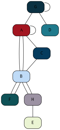
Figure 1: Example of a graph generally, this graph is not simple because it has loops and multi-edges
Expand Code Click Here
# #+begin_src javascript :exports code
# #+begin_src javascript :exports code
@startdot
strict digraph graphName {
        concentrate=false # This merges edges/lines
        fillcolor=green
        color=blue
        A [shape=box, fillcolor="#a31621", style="rounded, filled"]

        edge [
        arrowhead="none"
        ];

        node[
        fontname="Fira Code",
        shape="square",
        fixedsize=false,
        style=rounded
        ];


        # A -> B [dir="both"]
        A -> B
        A -> C
        C -> B
        B [shape=box, fillcolor="#bfdbf7", style="rounded, filled"]
        B -> F
        C [shape=box, fillcolor="#053c5e", style="rounded, filled"]
        D [shape=box, fillcolor="#1f7a8c", style="rounded, filled"]
        E [shape=box, fillcolor="#eaf4d3", style="rounded, filled"]
        F [shape=box, fillcolor="#0f5257", style="rounded, filled"]
        G [shape=box, fillcolor="#0b3142", style="rounded, filled"]
        G -> A
        G -> D
        H [shape=box, fillcolor="#9c92a3", style="rounded, filled", arrowType="dot"]
        H -> E [arrowType="dot"]
        H -> B
}
@enddot
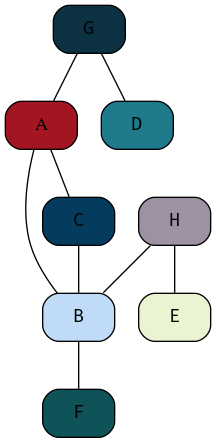
Figure 2: Example of a Simple Graph
1.2.2 Question 2
- What type of forces can we use in force directed methods?
where force directed methods are used to visualise a graph the following forces may generally be used:
- Attractive Forces
- Repulsive Forces
These forces will generally act in the direction of edges with magnitude proportional to the path.
Other types of forces may act however, for example:
- A Centre of Gravity
- This will pullnodes into the centre of the visualisation
- Radial, concentric or horizontal magnetic fields
- Repulsive forses from the boundary to penalise distant nodes
1.2.3 Question 3
- What are the advantages of force directed methods? Can these methods be effective on large graphs (e.g. > 1000 nodes)?
The advantage to implementing force directed methods is that they have an aesthetically pleasing layout that has the potential to carry more information which may in turn support quicker interpretation by somebody trying to interpret the visual.
Force directed Methods may improve the capacity for the intended audience to implement pre-attentive processing (Wk2, Q7) when reviewing the visualisation, this is because force directed methods move similar nodes together into clusters, this grouping is a principle of the Gestalt laws (Wk2, Q8) known to increase the perception of discrete categories in visualisation. Laws/
Force Directed methods are easy to implement in the sense that some mathematical description of a rule set needs to be passed to a graphing utility and then the process is more or less automatic.
- Using Force Directed Methods on Large Graphs
For very large graphs force directed methods can become unwieldly, slow to compute and generally the output can be to a degree unpredictable.
So generally no, these methods are not effective for large graphs, however in saying that, they might still give an interesting overview of the data set.
1.2.4 Question 4
- What are the common methods that are used to handle big graphs?
The common methods to preview large graphs are:
- Structural Clustering
- Modifying the
- Abstraction and Aggregation
This is because too many data points are not necessarily practical to visualise, they may end up being perceived as a hairball.
- Structural Clustering
- Multilevel Approaches
One Method is to implement a form of dimension-reduction, this is an alorithm that essentially groups multiple nodes into a single cluster and then instead represents those clusters.
This can be visualised as levels of height, similar to a pyramid, each level increasing in height corresponds to a reduction in the number of nodes until eventually there would only be one node at the top, then the question simply becomes choosing the level that corresponds to the most effective Visualisation (this is somewhat similar to a dendrogram).
- Collapsible Nodes
Collapsible Nodes leverages the interactive capacity of computing devices to folder multiple nodes into a common root, this is similar to the directory structure of a computer, to visualise this compare the terminal output of the following:
tree -L 1
tree -L 2
tree -L 3
- Multilevel Approaches
- Abstraction / Aggregation
Abstraction and aggregation involves merging nodes into common nodes by a similar trait, for example instead of listing every single car manufacturer as seperate nodes, maybe it makes sense to seperate the nodes by the vehicle fuel type or the country of origin (so BMW, Mercedes, VW would become 'European Car' and Dodge, Chrysler, Ford would become 'US Car').
This (probably) requires human intervention to a degree in order to identify which aggregate terms are the most reasonable to the topic that the visualisation is being used for.
1.2.5 Question 5
- List the 6 aesthetic criteria in graph drawing. In your opinion, which criteria is the most important for big graph visualization?
Aesthetic criteria in graph drawings are:
- Minimising the intersection of edges
- Scaling the Edge length to make the size both effective and accurate
- Minimizing the Total Area used.
- Redusing the maximum edge length
- large discrepencies between edge lengths can make graphs look non-uniform which is not aesthetic and can be distracting.
- Uniform Edge Length
- Striving to keep edges within a reasonable range of values can help 'pull
the graph together' so it looks like a single uniform graph
- Minimising the number of bends can stop the graph appearing too busy which can be distracting and make the graph hard to interpret.
Which criteria for an aesthetic graph is most relevant to a visualisation depends on the specific graph, but generally speaking minimising the intersection of edges can make for the most aesthetic improvement in a visualisation, this is because following lines can be a mentally taxing task.
1.2.6 Question 6
- Show the adjacency matrix for the following graphs
The Adjacency matrix for the graph shown in figure 3 is given by
Expand Code Click Here
# #+begin_src javascript :exports code
# #+begin_src javascript :exports code
@startdot
strict digraph graphName {
        concentrate=true # This merges edges/lines
        fillcolor=green
        color=blue
        A [shape=box, fillcolor="#a31621", style="rounded, filled"]

        edge [
        arrowhead="none"
        ];

        node[
        fontname="Fira Code",
        shape="square",
        fixedsize=false,
        style=rounded
        ];


        # A -> B [dir="both"]
        A -> B
        A -> C
        A -> H
        B [shape=box, fillcolor="#bfdbf7", style="rounded, filled"]
        B -> A
        B -> F
        B -> H
        C [shape=box, fillcolor="#053c5e", style="rounded, filled"]
        C -> A
        C -> H
        C -> E
        C -> G
        D [shape=box, fillcolor="#1f7a8c", style="rounded, filled"]
        D -> B
        D -> F
        D -> E
        E [shape=box, fillcolor="#eaf4d3", style="rounded, filled"]
        E -> C
        E -> D
        E -> G
        F [shape=box, fillcolor="#0f5257", style="rounded, filled"]
        F -> B
        F -> D
        F -> G
        G [shape=box, fillcolor="#0b3142", style="rounded, filled"]
        G -> C
        G -> E
        G -> F
        H [shape=box, fillcolor="#9c92a3", style="rounded, filled", arrowType="dot"]
        H -> A
        H -> B
        H -> C
}
@enddot
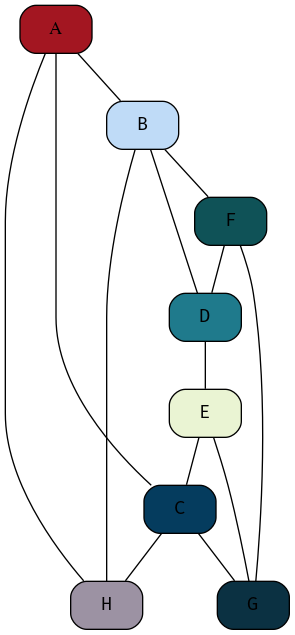
Figure 3: My attempt at reproducing the DOT graph from the Tutorial Sheet, this one isn't as good, but it's relationally equivalent.
| A | B | C | D | E | F | G | H | |
| A | 0 | 1 | 1 | 0 | 0 | 0 | 0 | 1 |
| B | A | 0 | 0 | 1 | 0 | 1 | 0 | H |
| C | 1 | 0 | 0 | 0 | 1 | 0 | 1 | 1 |
| D | 0 | 1 | 0 | 0 | 1 | 1 | 0 | 0 |
| E | 0 | 0 | 1 | 1 | 0 | 0 | 1 | 0 |
| F | 0 | 1 | 0 | 1 | 0 | 0 | 1 | 0 |
| G | 0 | 0 | 1 | 0 | 1 | 1 | 0 | 0 |
| H | 1 | 1 | 1 | 0 | 0 | 0 | 0 | 0 |
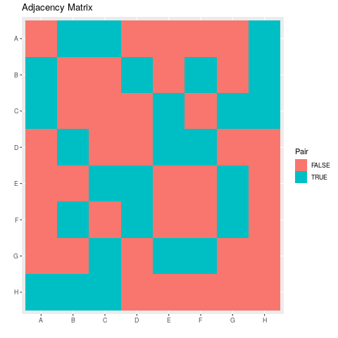
- Visualise the Adjacency Matrix
The Adjacency Matrix can be turned into vectors by using the following UltiSnips snippet in vim:
snippet vec
${1:var} <- c("${0:${VISUAL:/ /","/g}}")
endsnippet

snippet numvec
${1:var} <- c(${0:${VISUAL:/ /, /g}})
endsnippet
Hence putting this together in R in code listing 4 the following plot of the adjacency matrix shown in table 1 may be produced as shown in figure :
Expand Code Click Here
library(tidyverse)

names <- c("A", "B", "C", "D", "E", "F", "G", "H")
A <- c(0, 1, 1, 0, 0, 0, 0, 1)
B <- c(1, 0, 0, 1, 0, 1, 0, 1)
C <- c(1, 0, 0, 0, 1, 0, 1, 1)
D <- c(0, 1, 0, 0, 1, 1, 0, 0)
E <- c(0, 0, 1, 1, 0, 0, 1, 0)
Fv <- c(0, 1, 0, 1, 0, 0, 1, 0)
G <- c(0, 0, 1, 0, 1, 1, 0, 0)
H <- c(1, 1, 1, 0, 0, 0, 0, 0)

data <- matrix(data = c(A, B, C, D, E, Fv, G, H), nrow = 8, ncol = 8, byrow = TRUE)
rownames(data) <- names
colnames(data) <- names

# Rotate matrix 90-degrees clockwise.
rotate <- function(x) {
    t(apply(x, 2, rev))
}

rotate_ACW <- function(x) {
    t(apply(x, 1, rev))
}


  # Create Column Names
make_colnames <- function(matrL) {
                     factor(paste("col", 1:ncol(matrL)),
                            levels = paste("col", 1:ncol(matrL)),
                            ordered = TRUE)
}

 # Create Row Names
make_rownames <- function(matrL) {
                     factor(paste("row", 1:nrow(matrL)),
                            levels = paste("row", 1:nrow(matrL)),
                            ordered = TRUE)
}

# Create Row Names with reversed Order
make_rownames <- function(matrL) {
                     factor(paste("row", nrow(matrL):1),
                            levels = paste("row", nrow(matrL):1),
                            ordered = TRUE)
}


expand.grid_matrix <- function(mat) {
  data <- expand.grid("x" = LETTERS[1:8], "y" = rev(LETTERS[1:8]))
  data$z <- as.vector(rotate(mat))
  data$z <- as.logical(data$z)

  return(data)
}


data <- expand.grid_matrix(data)


ggplot(data, aes(x = x, y = y, fill =z)) +
  geom_tile() +
  labs(x = "", y = "", title = "Adjacency Matrix", fill = "Pair")
1.2.7 Question 7 ggnet
This GitPage Has a Tutorial on using ggnet
The Plotly library can be used to build a network graph. The dataset UKfaculty
contains relationships between members of a university in the UK.
The code in listing 5 produces the plot shown in figure 5
Expand Code Click Here
# Load Packages
library(plotly)
library(igraph)
library(igraphdata)

# Load the Data
data("UKfaculty")

# Set the Layout Type
G <- upgrade_graph(UKfaculty)
L <- layout.circle(G)

# Create Vertices and Edges
vs <- igraph::V(G)
es <- as.data.frame(get.edgelist(G))

Nv <- length(vs)
Ne <- length(es[1]$V1)

# Crete Nodes
Xn <- L[,1]
Yn <- L[,2]

network <- plot_ly(x = ~Xn, y = ~Yn, mode = "markers", text = vs$label, hoverinfo = "text")

# Create Edges
edge_shapes <- list()
for(i in 1:Ne) {
  v0 <- es[i,]$V1
  v1 <- es[i,]$V2

  edge_shape = list(
    type = "line",
    line = list(color = "#030303", width = 0.3),
    x0 = Xn[v0],
    y0 = Yn[v0],
    x1 = Xn[v1],
    y1 = Yn[v1]
  )

  edge_shapes[[i]] <- edge_shape
}


# Create Network
axis <- list(title = "", showgrid = FALSE, showticklabels = FALSE, zeroline = FALSE)

fig <- layout(
  network,
  title = 'UK Faculty',
  shapes = edge_shapes,
  xaxis = axis,
  yaxis = axis
)

fig
Figure 5: Network Graph; Needs to be spread out and improved