Tolerance Intervals
See 141 of EnvStats by Millard
Definition
A tolerance interval is a range that is likely to contain a specified proportion of the population, where ) is known as the coverage.
For example: Taking heights of students as an example.
Confidence Interval would be saying we are 95% confident that the population mean lies between 150cm and 200cm.
Tolerance Interval would be saying that we are 95% confident that 80% of the individual heights in the population lies between 150cm and 200cm.
The difference is that it isn't giving the range of values for a parameter estimate, rather it is a range where a proportion of future data points are likely to lie.
Constructing Tolerance Intervals
-content tolerance interval
This is constructed so that it contains at least of the poulation. i.e. the coverage is at least , with probability .
-expectation tolerance interval
This is constructed so that it contains on average of the population.
For a Normal Distribution
For normally distributed data, the upper () and lower () tolerance limits are computed form a series of measurements
Where is the tolerance factor:
- is the coverage ()
- is the t-distribution for , the significance level
- is the t-distribution for , the proportion coverage
Example in R
set.seed(222)
Y <- rnorm(100, mean=10, sd=2)

alpha <- 0.05  # significance level (95% CI)
P <- 0.85  # proportion of the population to be covered
n <- length(Y)

Ybar <- mean(Y)
s <- sd(Y)

## Calculating K tolerance factor
t_alpha <- qt(1-alpha/2, df = n-1)
t_P <- qt(1-(1-P)/2, df=n-1)

K <- t_alpha * sqrt(1 + 1/n + (t_P^2)/2/n)
U <- Ybar + K * s
L <- Ybar - K * s

print(paste("Tolerance Interval:", round(L, 4), round(U, 4)))
[1] "Tolerance Interval: 6.2033 13.8846"
Compare this with the EnvStats package
library(EnvStats)
tolIntNorm(Y, coverage=P, conf.level=1-alpha)$interval$limits
      LTL       UTL
 6.900067 13.187851
They are close but not equivalent, because the EnvStats package uses a slight different, more complicated algorithm (See 1).
But from this, we can see that with 95% confidence, 85% of the population will lie between 6.9 and 13.2
https://rdrr.io/cran/EnvStats/src/R/tolIntNormK.R
Control Charts
Control charts are a graphical and statistical method of assessing the performance of a system over time.
They were developed in the 1920s by Walter Shewhart and have been employed widely in industry to maintain process control.
However, control charts assume the observations are independent and follow a normal distribution with some constant mean and standard deviation
Shewhart Control Chart
A Shewhart control chart is to plot the observations over time and compare them to established upper and/or lower control limits that are based on historical data.
Once a single observation falls outside the control limit(s), this is an indication that the process is "out of control" and needs to be investigated.
The constant is often set to , and the limits are called 3-sigma control limits
CUSUM Charts
To detect a gradual trend in the process, we may use Cumulative Summation (CUSUM) charts.
For the future sampling occasion, the upper cumulative sum and lower cumulative sum
Where is a given positive threshold that corresponds to half the size of a linear trend (in units of standar deviations), dependent on how sensitive to detection.
With a CUSUM chart, we declare a process "out of control" when the upper/lower cumulative sums are more extreme that a pre-specified decision bound, called the decision interval. Typically this is between 4 and 5.
Example in R
## Writing out the data
month <- 1:8
## baseline values in 1995
baseline <- c(32.8, 15.2, 13.5, 39.6, 37.1, 10.4, 31.9, 20.6)
## compliance values in 1996
compliance <- c(19, 34.5, 17.8, 23.6, 34.8, 28.8, 43.7, 81.8)

nickel <- data.frame(month, baseline, compliance)
  month baseline compliance
1     1     32.8       19.0
2     2     15.2       34.5
3     3     13.5       17.8
4     4     39.6       23.6
5     5     37.1       34.8
6     6     10.4       28.8
7     7     31.9       43.7
8     8     20.6       81.8
## summary estimates from baseline
mean(baseline)
sd(baseline)
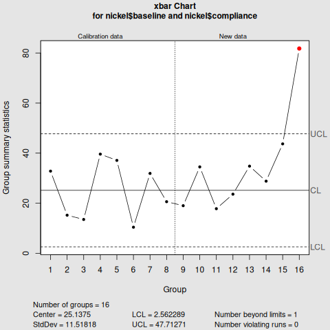
Shewhart Control Chart
library(qcc)
qcc(nickel$baseline,
    type="xbar",
    std.dev=sd(nickel$baseline),
    newdata=nickel$compliance,
    nsigmas=3,
    confidence.level=0.95)
CUSUM Control Chart
cusum(nickel$baseline,
      std.dev=sd(nickel$baseline),
      decision.interval=4,
      se.shift=1,
      newdata=nickel$compliance)
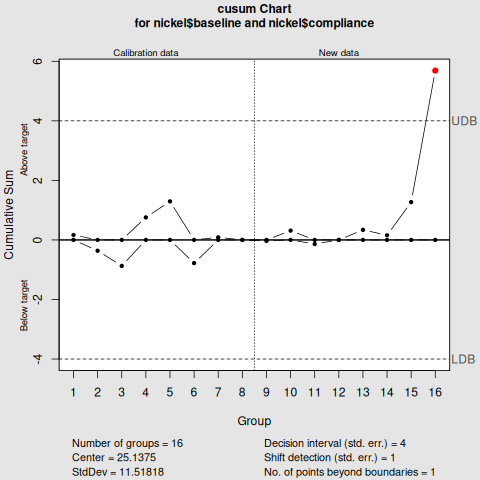
Interpretation
Notice that the key difference between the two is the nsigmas in Shewhart control chart, and the decision.interval in the cusum control chart.
From the two visualisations, month 8 exceed the upper limit, deeming the nickel concentration "out of control".
Summary
- Confidence Interval gives an estimate of a population parameter
- Prediction Interval predicts where a single future observation will fall
- Tolerance Interval gives a cover of where a specified proportion of the poulation will fall.
- Control Charts have been suggested as an alternative to prediction or tolerance intervals, for determining whether a process is in a state of statistical control.